JULY 2019 - DECEMBER 2019

Two years ago, on the same day that I am writing this (July 4th), a couple friends and I ventured to a nearby park with a basket filled with vodka penne, mango Häagen-Dazs ice cream, and my homemade mozzeralla sticks. In addition to a successful picnic, we also had a successful photoshoot. We were really thriving pre-covid.
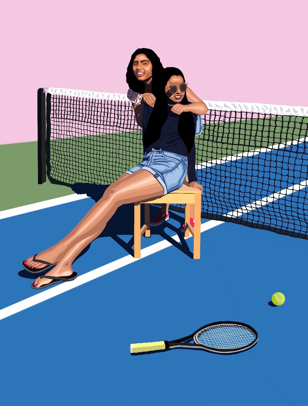
A couple days after, all the photos were uploaded to our shared google album and I had a chance to examine which ones were the best. Many of them were spectacular, but I really liked this one of me sitting on a chair looking off into the distance, my friends arms wrapped around me as she smiles at another camera. I opened up Autodesk Sketchbook (because that's what I used at the time) and started what would be my first digital portrait!
I imported the picture into the app, and started by tracing the bigger forms. I chose a pallete of browns for the legs and started coloring them in. I thought maybe it would be this algorithmic throughout - identify a form, choose a color pallete, and fill it in. This held true for the denim shorts, but my shirt was too dark to follow this procedure on. The chair also did not have dramatic enough shading. It was then that I learned that the work was not all mindless; creating aesthetically pleasing art often is a product of many design choices. I decided to ignore the slight shading on the shirt and chair and just block in the colors. I could go on about how I chose to depict everything, but you get the idea. Besides, you can just look below to see how it turned out.
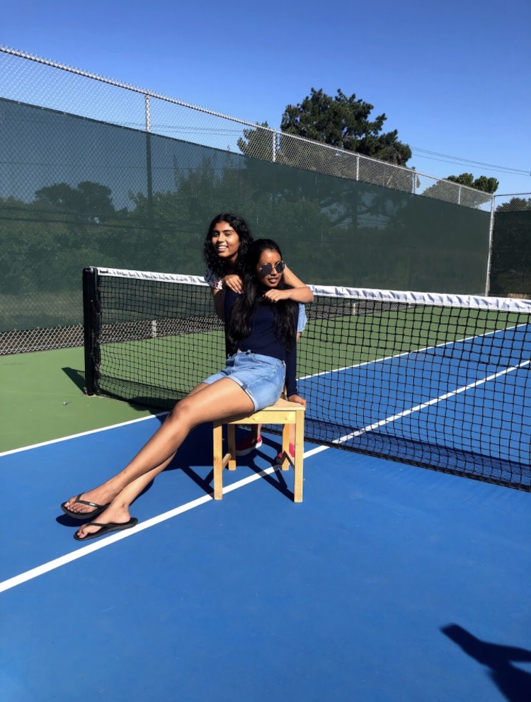

I liked how I was able to take an image and preserve, simplify, and stylize the elements. I was also able to add elements (the tennis racket and ball), take out elements (some unnecessary shadows), and change elements altogether (the background now majorly consisted of a muted pink, blue, and green). I must have really gotten into my groove because I decided to do another painting in the same style - and I completed it in less than two days.
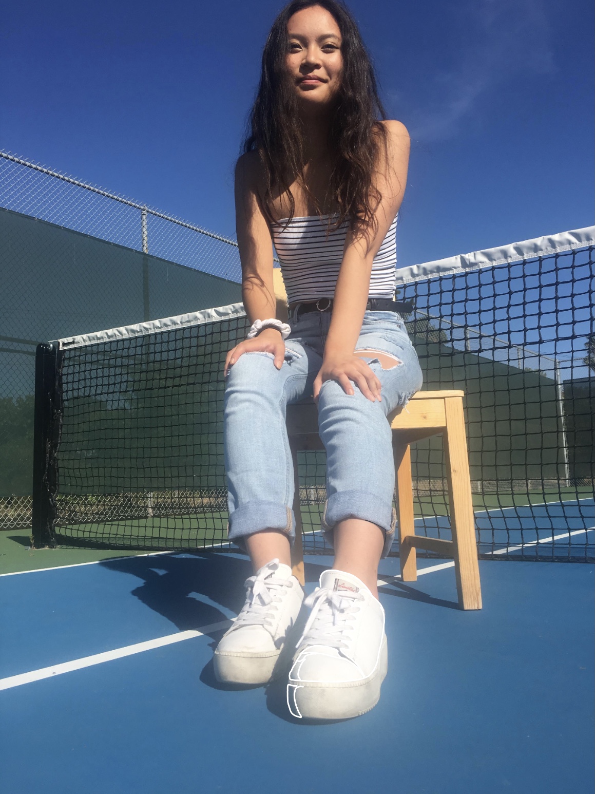

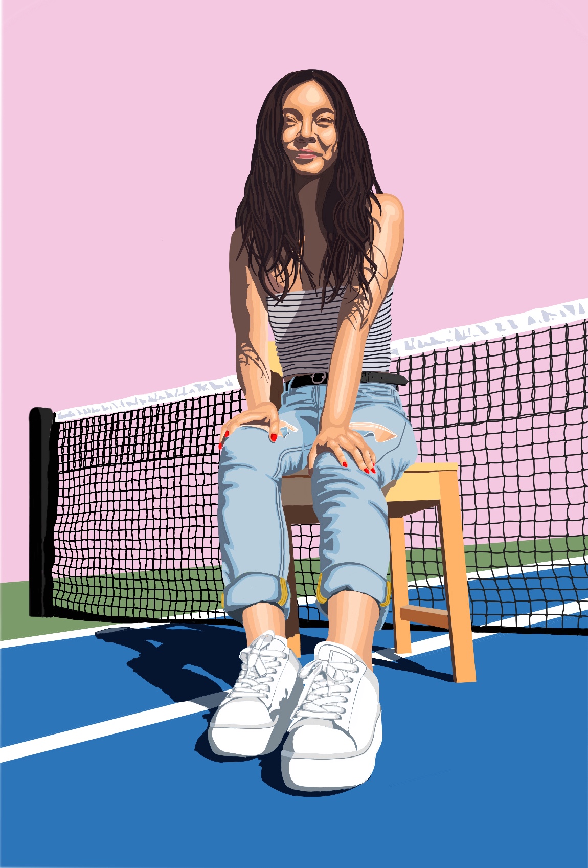
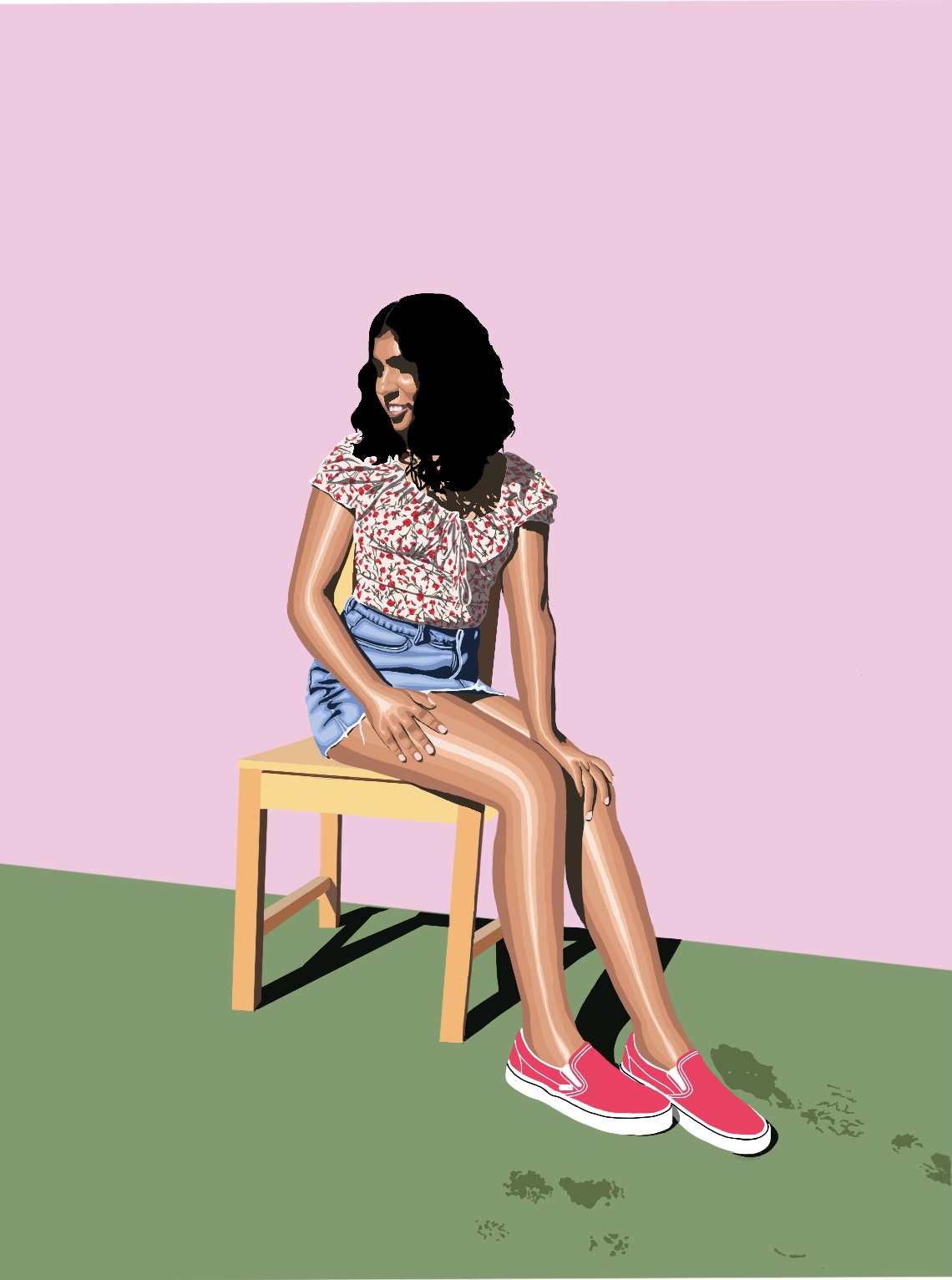
That was all I did for this project that summer. However, when I got a spare minute in college, I started another painting on Procreate (I had finally graduated from Autodesk Sketchbook). I didn't touch it again until the first few days of winter break, but was able to finish it much faster than I had the other two - Procreate definitely has its perks compared to a free drawing app! However, they both got the job done. And I know I didn't do the shadow behind my friend on the pink "wall" - I would have to extrapolate it and I was scared I wasn't going to get it accurate at all.
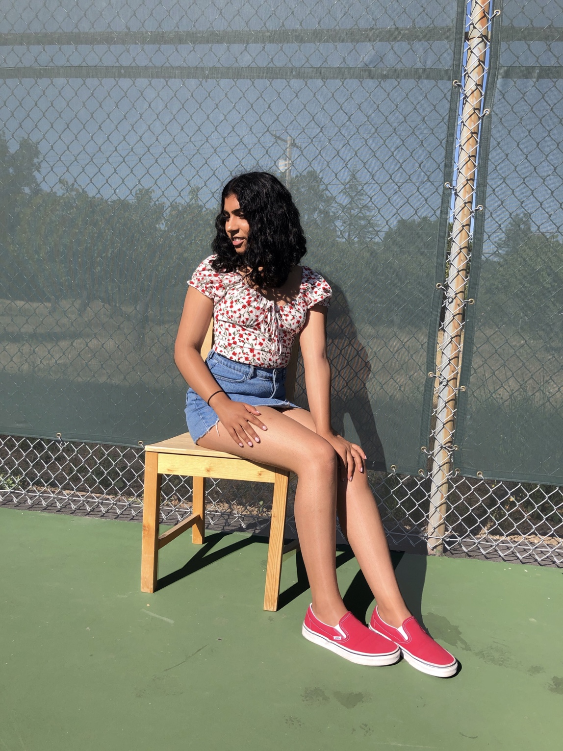

Looking at the collection of three together, I think there are things to celebrate but also things that could be improved. The style is pretty consistent with the background colors, and I tried to include little red in each piece (shoes, shirt, nail polish). Red is an easily noticable color and will often give viewers something to remember, so that was a good call. However, I feel like the last piece is really lacking the tennis net and the blue of the court. I feel like adding the net is out of the question since the original picture was just directed away from it. I went ahead and added some blue to this piece in the thumbnail that led to the description of this project, but I am yet to make another official version of it!
